
When it comes to finding a font to use for your design, there are many things to consider–how the feel of the font should match the style of your design, the look of each letter or whether it matches the other fonts you’re using. One thing that is sometimes overlooked though is Kerning.
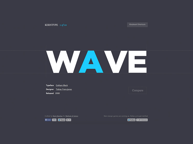
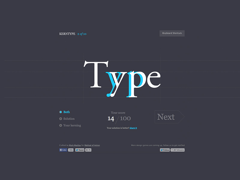
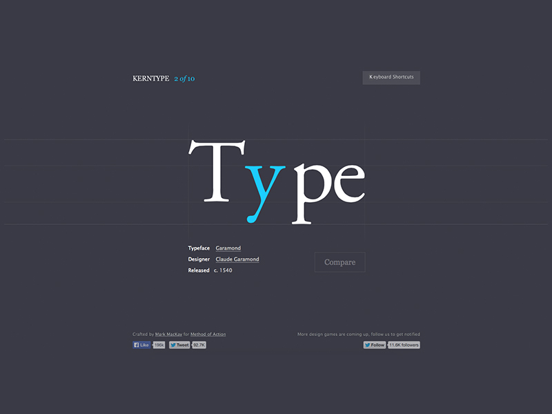
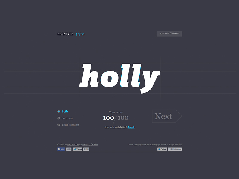
Kerning is adjusting the space between characters. If the kerning of your typeface is off it can affect your whole design. Mark Mackay, who created The Bezier Game (http://bezier.method.ac/), the color matching game (http://color.method.ac/), and the shape type game (http://shape.method.ac/) for method action, created a game to train your eye and properly kern letters. The game is pretty simple, click on the letter you think needs kerning and drag it or use the arrow keys to move it. When you’re satisfied with your work, click next and your work will be graded and compared to the original kerning. It is a fun game for anyone who is interested in typography.
Visit http://type.method.ac/ and test how well you can kern your letters.